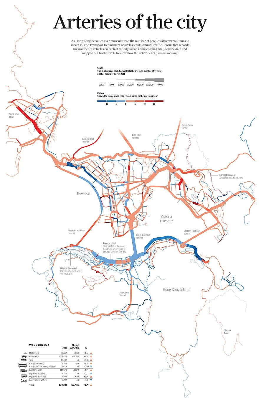
Published in October 2012, shortly after Hong Kong's Transport Department released their annual traffic census, this graphic visualises daily traffic on almost every stretch of road in the city.
The thickness of each line represents the average daily number of vehicles traveling on that stretch of road. The colour represents the percentage change on last year.
You can clearly see that the main roads along the front of Hong Kong Island were still the busiest. But judging by the colour, the traffic has mostly decreased compared to last year. You can also see that a lot of the roads in Kowloon have seen more traffic.
There is also a clear change in the cross-harbour tunnels. The Eastern and Western Harbour Tunnels have increased in traffic compared to the central tunnel which has decreased. But they still see less traffic.
By Simon Scarr
South China Morning Post
